Growing out of playful design
4. min
Jan 26, 2026
As companies mature, their websites often struggle to signal trust and stability. This note explores why playful UI can start working against growing businesses and what “mature” design really means.
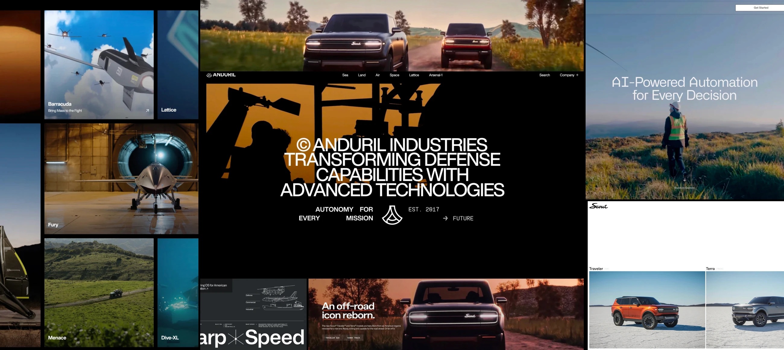
Many companies don’t choose playful design deliberately. It’s often inherited from templates, early brand decisions, or the pressure to look modern and approachable at launch. In the beginning, this visual language works well. Friendly colours, expressive UI, and informal layouts help attract attention and reduce friction when a business is still introducing itself.
As companies grow, the context around the website changes. The audience becomes more considered, decision cycles get longer, and the website shifts from being a first impression to becoming a surface that supports trust. At this stage, the same playful design choices can quietly start to work against the business, not because they are wrong, but because the signal no longer matches the company’s maturity.
The subtle shift in first impressions
This change is rarely obvious. The site doesn’t suddenly look outdated or poorly designed. Instead, it begins to feel slightly unsettled. Not unprofessional, but lighter than expected. Not unclear, but less reassuring than it should be. Teams often sense this before they can clearly describe it. Something feels off, even though nothing appears broken.
This is usually the moment when questions about credibility, longevity, and seriousness start to surface, often indirectly, through slower sales cycles or hesitation from more senior stakeholders.
What “mature” design actually means
Mature design is often misunderstood as being corporate, minimal, or cold. In practice, maturity has very little to do with visual style and far more to do with structure and confidence. A mature website doesn’t rely on novelty or decoration to communicate value. It feels stable, deliberate, and comfortable holding attention without trying to impress.
In practice, this maturity tends to show up through:
clear and stable page hierarchy
confident spacing and restraint
reduced visual noise and fewer gimmicks
content that stands on its own without excessive styling
consistency in tone, layout, and purpose
Together, these signals create a sense that the business knows where it’s going and isn’t rushing to prove it.
Why teams stay in the playful phase
Many teams recognise the need for change but hesitate to act. There’s often a fear of losing approachability or alienating early supporters. Founders may feel attached to the original identity that helped the company gain traction. Designers may continue optimising for novelty because there’s no clear moment when the business collectively agrees it has entered a new stage.
This is rarely a matter of taste or capability. More often, it’s a question of ownership. Without a clear decision about who is responsible for the signal the website sends, the design continues to speak in an earlier voice.
The quiet transition that actually works
The most effective transitions away from playful design rarely begin with a full redesign. They usually start with quieter, more structural decisions. Clarifying what each page is meant to achieve. Simplifying hierarchy so important information carries more weight. Reducing visual noise before adding new elements. Letting content lead before decoration takes over.
Once the structure is stable, the design no longer needs to work as hard. Visual confidence follows naturally when the foundation is clear.
A final hought
As companies mature, their websites don’t need to become louder or more expressive. They need to feel settled. That sense of calm is often what allows a site to support bigger decisions, longer relationships, and higher levels of trust. It’s also what quietly separates being noticed from being believed.